MindTech Guru (MTG)
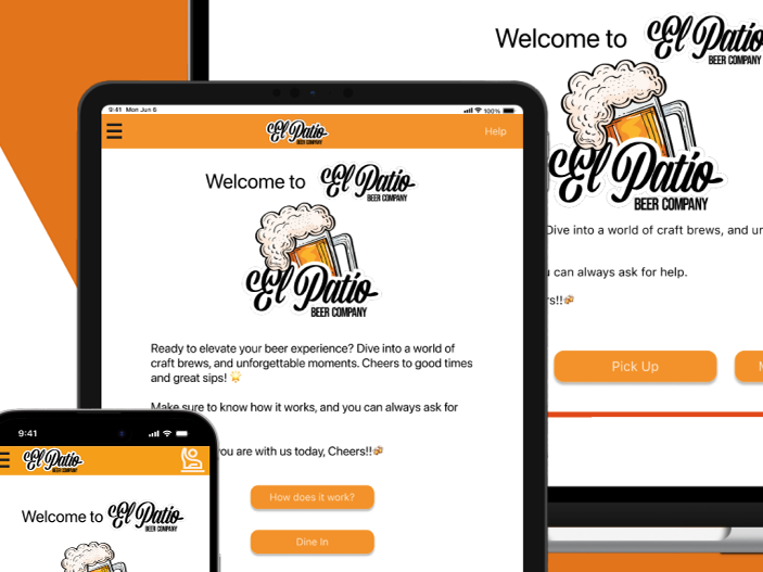
Over the course of a 4-week internship, I designed both the mobile and desktop results experience and the conversational UI for MTG's AI-powered questionnaire. Working alongside a design partner and in close collaboration with the client and a two-person development team, I went through 4+ rounds of iteration — producing over 100 screens across components, auto layouts, and responsive variants for mobile and web.
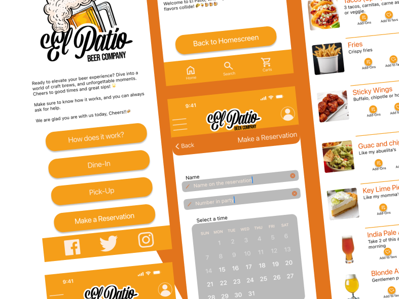
The most significant shift happened in the results page layout. My initial wireframe concept — a swipe-based card interaction rather than a traditional scroll — was passed over in the first round. The idea felt too rough to evaluate at low fidelity. In the second round, once I brought it to high-fidelity with animation, the client immediately saw what I had envisioned: the swipe interaction was easier on the eye, reduced cognitive load, and felt more natural for users browsing through matched providers. The first idea came back — refined and validated.
The conversational UI for the questionnaire was a deliberate departure from a standard form. A traditional form would have felt clinical and transactional for users in a vulnerable moment seeking mental health support. The conversational flow was designed to feel accessible and human, reduce drop-off by keeping users engaged one question at a time, and collect richer data for more accurate AI-powered matching.
Project Overview
Tools: Figma
Role: UX Design Intern
Prototypes
Past Versions
Impact
Through iterative feedback from the client, design partner, and development team, the final design resolved the core tension between information density and emotional accessibility — surfacing insurance, FSA, and HSA coverage clearly without overwhelming users at a sensitive moment in their journey. The shift to high-fidelity prototyping mid-process was a key decision that unlocked stakeholder alignment and ultimately shaped the final product.
Behind the Scenes